North Pole Engineering
North Pole Engineering (NPE) is a product and engineering service company based in Minneapolis. For over 20 years NPE has been providing sensor based technology to a wide range of companies and markets in the sports, fitness and wellness industries. Helping to integrate cost-effective technology for their clients’ sensor-based products in order to move data to the internet is NPE’s goal.
The objective of this project was to redesign (and develop) NPE’s e-commerce website, so visitors could clearly navigate the products and services to easily purchase, or reach out to NPE. With this website serving as a lead “engine” for the business, other asks were to design the site to be functional, modern and user-friendly. B2B and B2C target audiences for the website included home fitness enthusiasts, gyms, fitness studios and wholesale customers.
I led the project, designing the website in Figma from built out wireframes, while simultaneously updating NPE’s brand assets and visual look—which were also applied to new trade-show booth banners. The updated identity included an improved logo, color palette, typeface, icon library, patterns and photography style.
Checkout the live website: https://npe.fit
Agency: Hunt Adkins
Group Creative Director: Sarah Kearin
Senior Copywriter: Andrew Brady
Senior Designer + Art Director: Emma Dahlgren
Designer: David Jaimes
Production Designer: Shelley Wicinske
Developer: Travis Manick


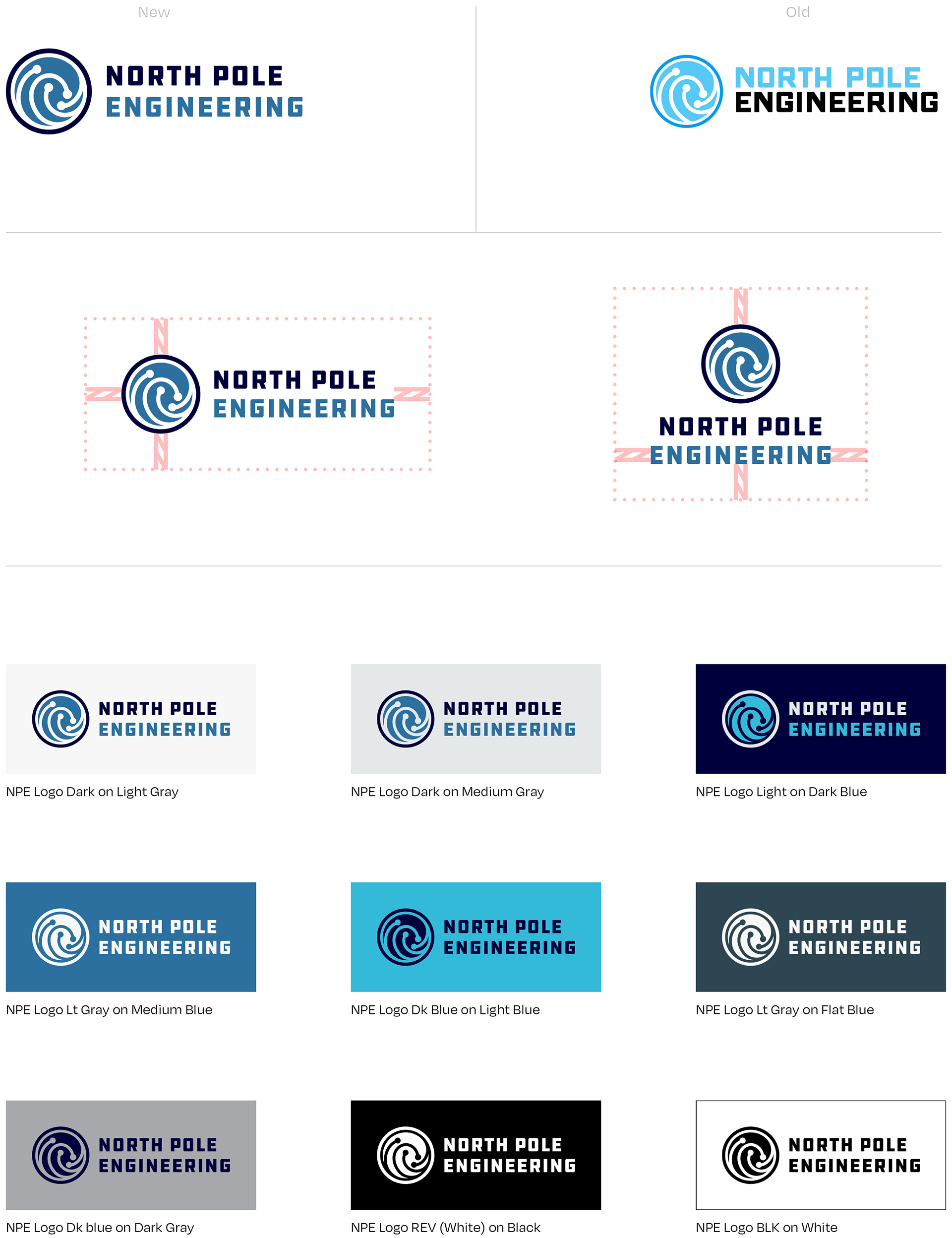
Logo Update
• Width of lettering and symbol match marrying them together
• Color combinations are web-accessible and highly recognizable
• Unique and ownable to NPE
• Legible when scaled at small sizes due to adequate spacing throughout the marks' shapes and distinctive counters and apertures within the typography
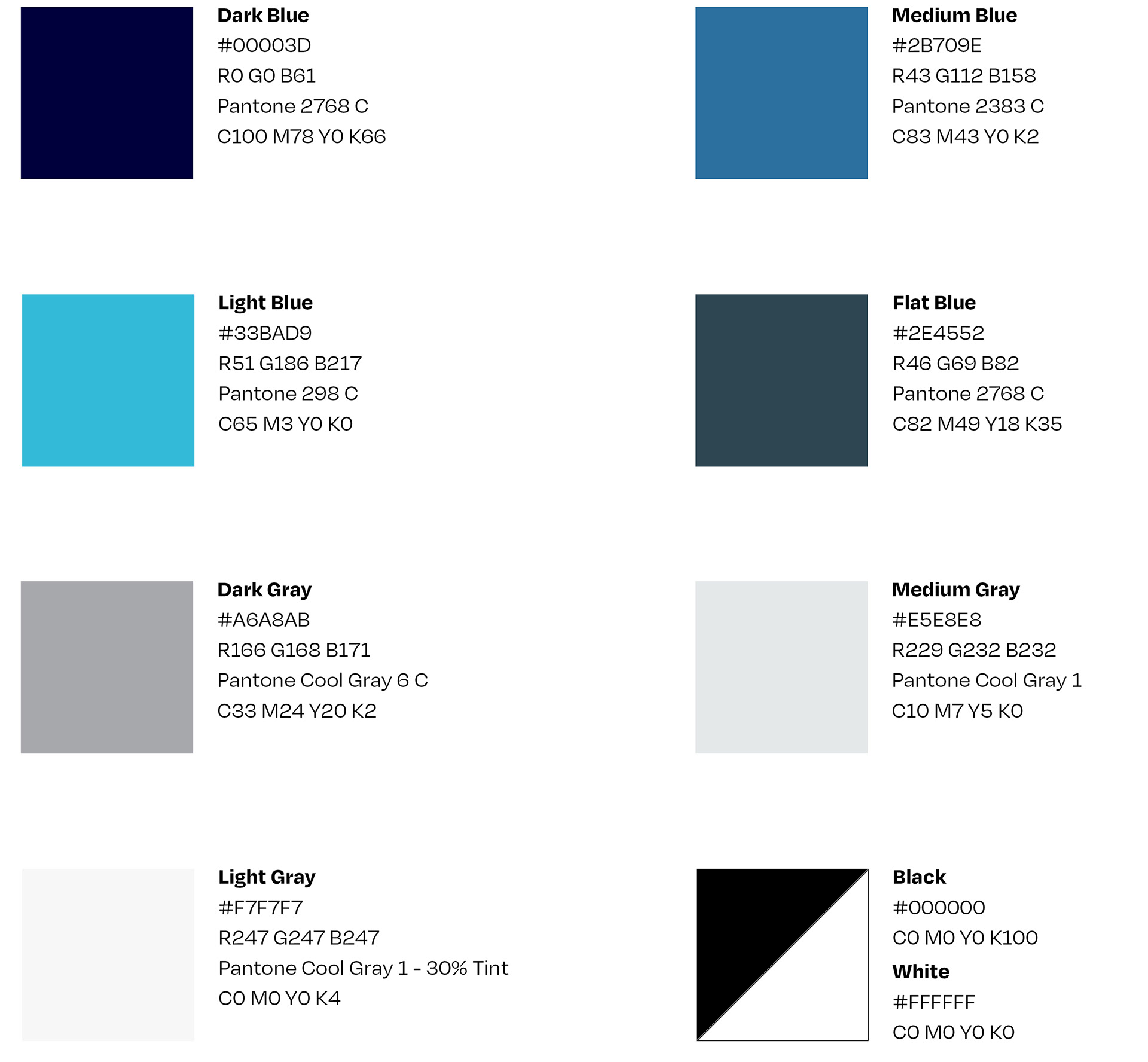
Color Palette
• Monochromatic color palette aligns with current brand guidelines
• Muted tones allow the message, product and photography to move to the forefront
• Accent gray color palette adds contrast and variety
Typography
• The sans-serif typeface Poppins offers a modern look, geometric structure and 90˚ terminals that relate back to simple grid systems and color blocking. A technique that’s used in NPE’s new identity

Photography
• Tightly cropped imagery
• Fairly dark with heavy contrast creates a moody feel
• Fitness equipment is recognizable
• Person as well as equipment are center focus

Duotone Images
• Duotone treatment creates a unique look and personalized feel for NPE
• Adds intensity to images
• Wide range of use from background to overlay text and buttons, or a hero image

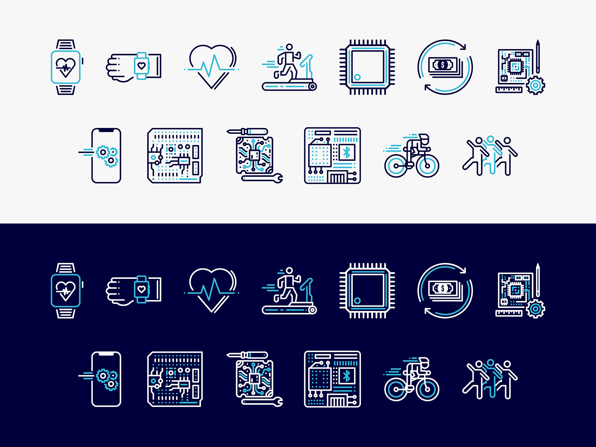
Icons
• Additional icons were created based of NPE’s design services and equipment used with devices
• Usable on more than one color
• Library of icons adds to NPE’s toolbox of usable assets
*Icons were downloaded from The Noun Project, then manipulated and altered.
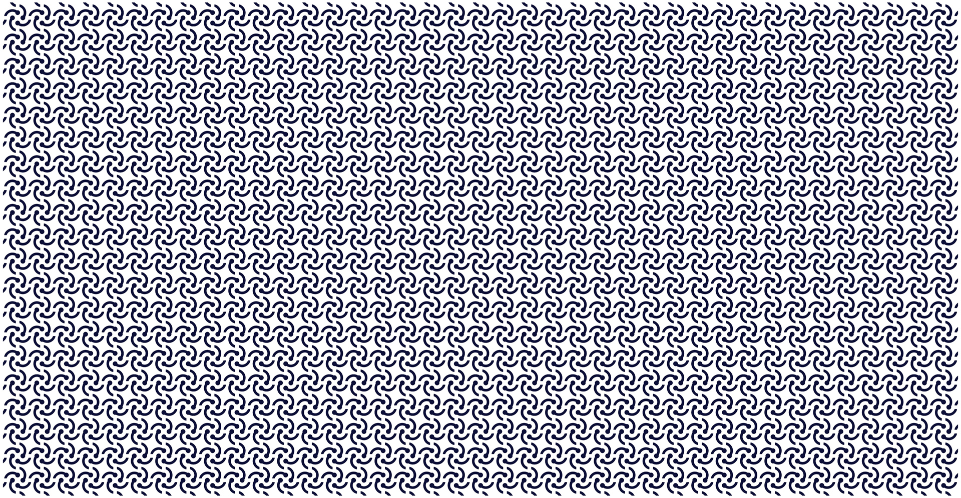
Interweaving Pattern
• Interweaving Pattern stems from the logo mark. It shows the relationship of what NPE is about: Connection between data and internet, connection between people and solutions, and connection between people and results
• Should rarely be seen without an image of someone working out / exercising
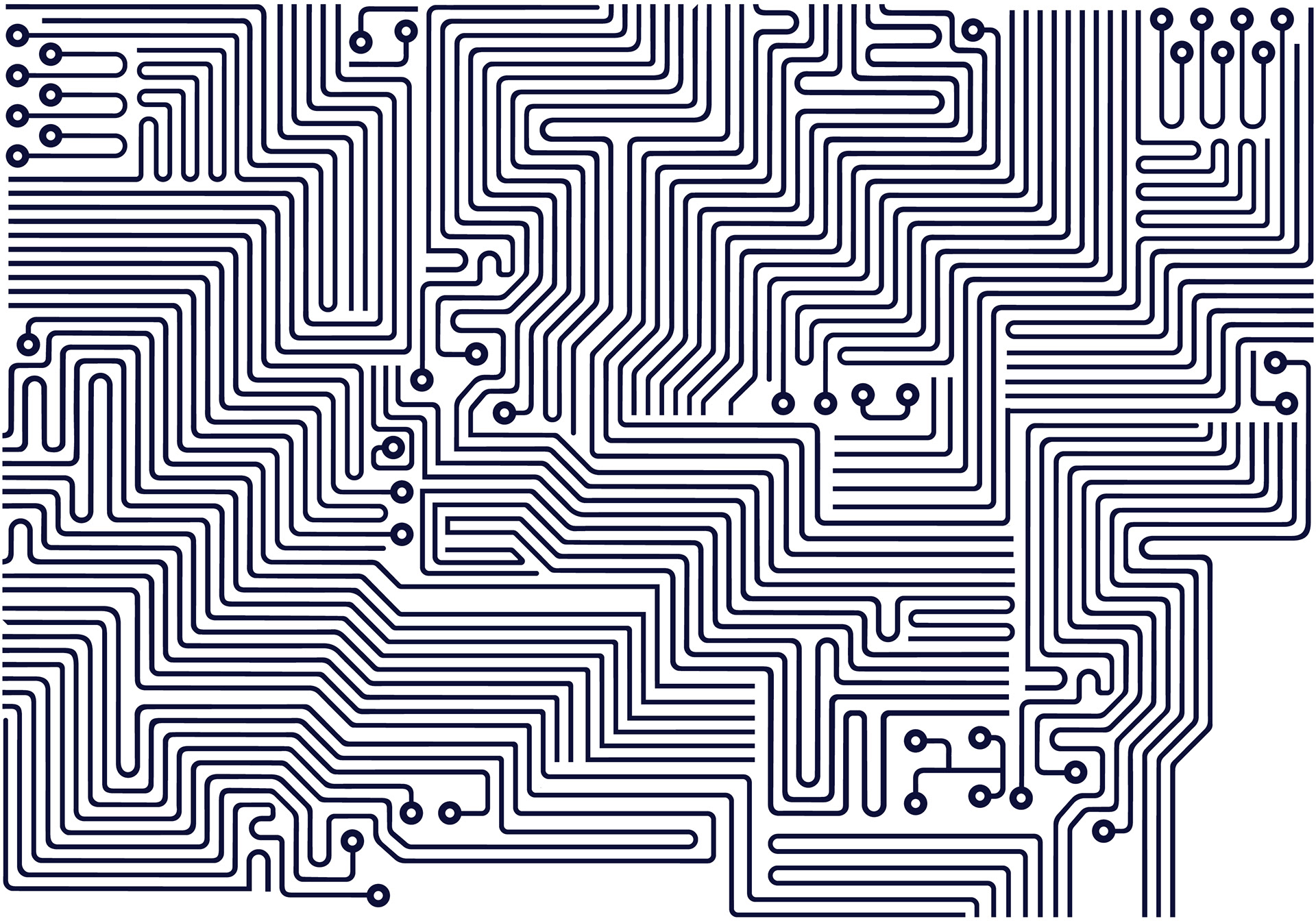
PCB Pattern
• NPE’s design services include
PCB design/creation, prototype analysis, engineering support, etc.
PCB design/creation, prototype analysis, engineering support, etc.
• Printed Circuit Board patterns and graphics tie into NPE’s services
• Evokes technology and what makes NPE’s devices work
Dot Pattern
• Dot pattern is inspired by data visualization and workout tracking (i.e. scatter plot graphs, line graphs)
• Digital and technical aesthetic
• Relates back to how NPE devices help track data during workouts